Intentional creativity and belonging through colour
Dulux has unveiled its Colour Forecast for 2027, a vibrant exploration of the colours shaping our homes, celebrating joy, individuality and everyday rituals at a time marked by rising living costs and the rapid acceleration of artificial intelligence.
GALLERY
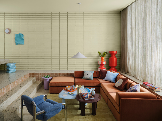
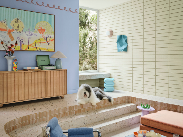
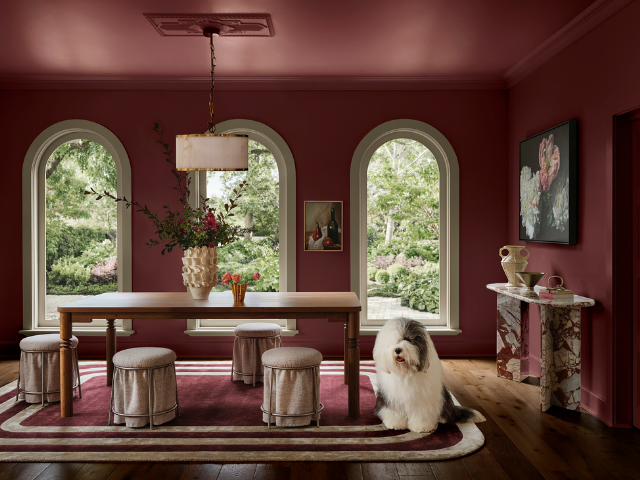
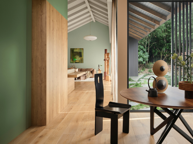
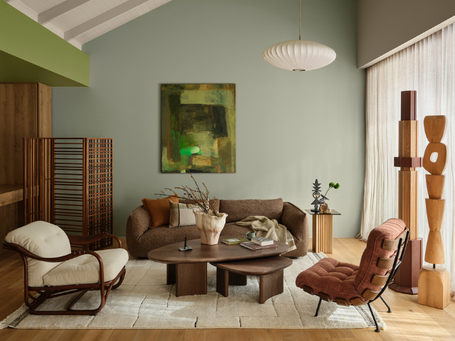
Curated into three distinct palettes – Play, Treasure and Sensory – this year’s forecast draws on calming blues, comforting botanical tones, and sophisticated jewel-like shades. Each palette reflects a universal craving for authenticity, meaningful connections, and the celebration of life’s spontaneous moments.
Carefully tailored by the Dulux Colour Team, which is led by Colour and Design Manager Lauren Treloar and Colour Marketing Lead Lilybet Holt, the annual Dulux Colour Forecast is grounded in extensive, year-round research into global and local trends set to shape Australian interior design and the way we live. Since 1999, the Forecast has been a cornerstone of innovative design inspiration for designers, architects and homeowners alike.
“To distill the ever-evolving trend landscape, the Dulux Colour Team collaborates closely with international brands, attends design shows and seminars, runway presentations, and global events including Milan Design Week,” says Treloar. “We also draw from customised trend research and insights accessed through Dulux’s global network across the UK, Europe and Asia-Pacific. As members of the Color Marketing Group (CMG), we analyse key reports from CMG as well as forecasting firms such as Color Hive and LS:N Global to enrich our forecasting to reflect what’s ahead.”
Holt adds, “As we become increasingly technologically sophisticated, many of us are also feeling more socially disconnected. In a world shaped by algorithms, endless content and digital noise, there is a growing sense of sameness and overstimulation. The palettes reflect an urgent desire to create spaces that feel more personal, expressive and deeply human.”
In response, Australians are seeking colours that offer a sense of balance and belonging, creating calming and vibrant interiors that reconnect them with the natural world and encourage introspection and joy. Treloar notes “Across each of the three palettes there is a return to softened yellow-greens and blues with grey and purple undertones that captivate our collective longing for grounding. Simultaneously, bright berry and cherry accents serve as markers of personality and optimism, injected sparingly across spaces.”
Treloar adds, “Our palettes are designed for cohesion and personalisation, offering users the flexibility to integrate shades seamlessly into their unique spaces, ensuring that the essence of each palette is preserved while celebrating individual style.”
The Dulux Play palette infuses interiors with vibrant energy and joy, capturing the essence of analogue interaction through music and games and the charm of imperfect moments in everyday life. This palette dares to disrupt, celebrating modernity with a flexible, human-first and accessible approach to design.
“Dulux Play reintroduces artistry into our spaces,” states Treloar. “This palette revels in the freedom of modular designs and the tactile beauty of asymmetry, encouraging creativity and movement, ideal for celebrating life’s glorious unpredictability. Packed with soft pastels, Dulux Play is a colourful collection of muted lilacs such as Dulux Stately Frills, calming blues like Dulux Powder Blue Half, spearmint greens including Dulux Catnap, and zesty orange and berry accents like Dulux Temptress and Dulux Baca Berry,” comments Treloar. “Defined by contemporary timbers, and modular designs, these spirited hues bring accessibility, transforming spaces to fit our whims with joyful character.”
Treloar concludes, “With playful patterns, rubber elements, and imperfect embellishments, Dulux Play creates wonderfully joyful landscapes where spontaneity and diversity reign, echoing our collective journey towards embracing life’s beautiful imperfections.”
Visit Dulux to learn more about the 2027 Colour Forecast.
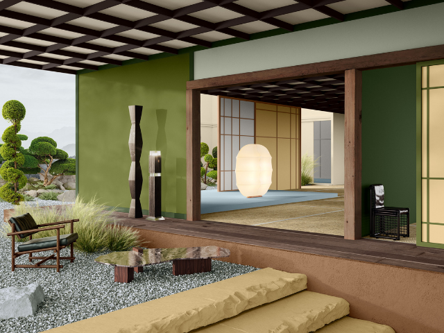
Cover Image Credit: Dulux Colour Forecast 2027 – Sensory palette.
Styling: Bree Banfield
Digital Imagery: Clinkr Studio



When an architectural feature begins to deteriorate, replacing the entire structure is not always the best solution. At Claremont ...
A new town centre and a land-lease village of up to 364 homes are proposed for Yalyalup, as ...
Melbourne’s historic Jam Factory is being reimagined as a $4 billion mixed-use precinct, with GURNER aiming to turn ...
Delivering a high-performance building requires more than specifying efficient products. At The Illawarra Grammar School in Wollongong, the ...

A 1ha section of surface car parking at Salisbury Downs' Hollywood Plaza could make way for a new ...